Back
Bento Blocks Dev-Log: User-Centered UI design
May 2024:

Prototype
During the early prototyping of Bento Blocks, we conducted user testing with friends to gather preliminary feedback. This helped shape our UI and UX, balancing usability and thematic (Cozy) consistency. Below is a summary of the feedback we received, along with our design responses to enhance gameplay and interface clarity.
Summary of Player Feedback
- Enable cutting while holding the knife for continuous interactions.
- Clarify objectives and the star reward system.
- Enhance cutting interactions for a more satisfying.
- Players appreciated that the game could be completed with any number of cuts.
- Some players found the interface difficult to navigate. They did not know how to use the knife.
- Add a grid overlay to help players visualize the game space.
- Improve clarity around the knife’s functionality. Some players were a little lost
Design Response: Reactive-Cursor

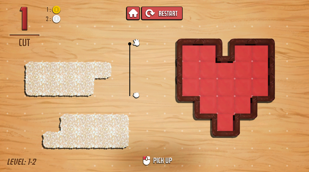
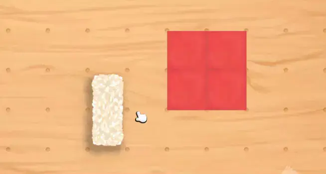
To enhance player interaction clarity and subtly teach players about their actions in a diegetic context, a reactive cursor system was implemented. We made the cursor dynamically adjusts the sprite based on the item held and the object beneath it, hoping to providing players with immediate visual feedback and intuitive guidance without explicit instructions.
Drawing on Don Norman’s principles of feedback and affordances from The Design of Everyday Things This design feature aims to create effective feedback that reinforces game-mechanics understanding [1].
Design Response: Dynamic Tutorial

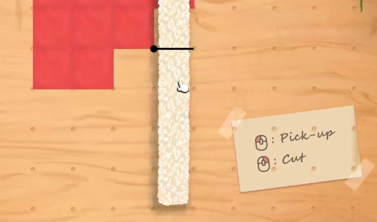
Another design response we developed to teach players the controls is a simple diegetic tutorial that responds to player input. While still in an early stage, this tutorial effectively guides players through interactive feedback. Future iterations will incorporate animations to better communicate player actions and their consequences, enhancing clarity and engagement.
References
| ↑ | [1] | Norman, D. A. (1988). The Design of Everyday Things. New York: Doubleday. |